Cracker Barrel's Logo Makeover Drama: A Total Design Disaster
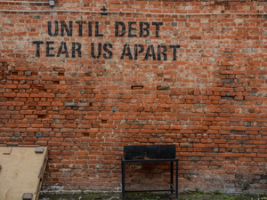
Photo by Erik Mclean on Unsplash
In the world of corporate rebranding gone wrong, Cracker Barrel just served up a hot plate of chaos that’ll make your head spin faster than a country line dance.
After a spectacularly failed attempt to modernize their iconic brand, the restaurant chain has officially dumped Prophet, the San Francisco design firm responsible for the logo transformation that sent their loyal customers into a full-blown meltdown.
The Logo That Launched a Thousand Complaints
Imagine taking an institution as quintessentially American as Cracker Barrel and stripping away its soul faster than you can say “biscuits and gravy”. That’s exactly what happened when they ditched their beloved man-in-overalls logo for a “streamlined” design that looked about as exciting as unseasoned chicken.
The Backlash Heard 'Round the Country
The redesign was so unpopular that even political figures took notice. Customer visits plummeted by a jaw-dropping 8% after the logo change, proving that sometimes, if it ain’t broke, don’t fix it. The restaurant’s leadership, led by CEO Julie Masino, quickly realized they’d stepped in it and reversed course faster than a pickup truck doing donuts.
A Lesson in Brand Identity
In a classic corporate plot twist, Cracker Barrel not only abandoned the new logo but also suspended restaurant renovations that had already begun at four locations. They brought back Thomas Yun, a former executive, and showed Matt Benton, their VP of marketing, the door - all in an attempt to course-correct this branding blunder.
The moral of the story? Sometimes, tradition trumps trendy - especially when your core audience loves you precisely for who you’ve always been.
AUTHOR: tgc
SOURCE: CNN

